12.23.2008

human scale


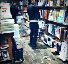
while i'm the first to pop my eyes at a wall of books rising to the rafters, i often think about the lonely life of books positioned well above a reachable level. even with a library ladder, it's always the books within arm's reach that will get the most attention. the rest become, for the most part, decoration. so while i'm awed by sky-high libraries, i'm equally enamoured by the intimate scale of interiors by architects like adolf loos and frank lloyd wright. the bibliothèque nationale in paris couples a monumental space with shelving designed according to human proportions (see image above, from "the library at night" by alberto manguel).

an inventive way to get a little extra accessible height to bookshelves is shown in the library of the judd foundation in marfa, texas (shown below). the bottom shelf extends out at double-depth to provide a bench seat for either sitting to read at the case, or for standing on to reach the highest shelves. this is a good solution for those that might be too short for the top few shelves, or those who only need a little extra step to to the top shelf. it's integral, self-explanatory, and effective. a great idea.

12.03.2008

vasu


smart and self-contained, vasu is stackable, wall-mountable shelving designed by mikko laakkonen for covo. could be a nice way to move books as well, all you'd need to do is plastic wrap each section & carry that section by its built-in handles.

11.03.2008

enzo mari


the unbelievably prolific designer enzo mari has created some truly beautiful shelving in all sorts of materials, including the metal systems shown above, manufactured by robots in italy. he's also designed bookcases in wood and cardboard. so, what does mari use in his own home? none of the above. he uses the out of production glifo, a super-flexible polypropylene system he designed in 1967 (shown below, from the book "at home with the makers of style").

'93-'08


as the name suggests, the '93-'08 shelving system by horm was originally designed in 1993, and recently updated.

information from horm: “It was 1993 when Solaio was born, a product that to this very day is still a herald of the company style, inspired by a Gardella architecture.
This year we present the third evolution of that system, with a different name, since we felt the need to underline the new aesthetic statement and, above all, to remind us and the world about the fact that this line still belongs to after 15 years”. We were finally able to get rid of the rear elements, to optimize height, to rationalize the various cavities, and to easily expand width, to insert the writing desk and the ultra-slim TV, to have a bar shelf, boxes for secret objects, a tray that seems to float in mid air, to create the corner. A graphic game that becomes a further response to contemporary trends that suggest light, versatile bookshelves, that are simple and straight-forward only at first sight."

10.29.2008

ellen allien


ok, it's not books, and ok, i'm not even certain where the shelves are from, and ok, ok, this picture's been floating around the blogosphere for a while now, but i couldn't resist posting german dj ellen allien's great living room full of shelves. sue me.

10.28.2008

influence


no question what "influenced" this line of low-cost shelving from habitat. it gives nods to many great designs, including classics by vitsoe, zanotta, and cappellini. habitat have made a nice, clean, minimal system they can call their own. ikea tried a similar imitation that fell short with cheap looking finishes and glass shelves. (personal preference. the dust and fingerprints that show up on glass shelves makes them a high maintenance nightmare. plus, the ikea system has painted wood, satin finish metal and glass all in the same system. i much prefer the all-in-one look of the habitat system.)

stay


available only at heal's in the uk, the stay line of shelving has been "specially designed to lean against a wall and brace under its own weight", though it doesn't seem terribly necessary: the design looks bulky enough to handle two back legs without changing its look substantially. still, i find something quite endearing about the low unit. now, when does heal's open in the us?

tight spots


anyone who rents a variety of apartments in new york (or many other big cities with cramped spaces) will inevitably be vexed with the problem of narrow spaces between windows or doors. often these types of spaces may represent the only wall space in an apartment, creating a big problem for storage. a long history in furniture has taught me that very few companies make bookcases for very narrow spaces, and those that do seem to discontinue them quickly. so if you are one of those who've been faced with this dilemma, get your hands on a carlson white tower from cb2 before cb2 stops making them. while much of cb2's storage throws me off with features like "champagne stained nickel" and "frosted glass", the carlson comes in a bright white powdercoat finish that i can live with.


i've also seen people place a few ikea lerberg wall shelves (below) sideways, stacked above one another, in a narrow spot, as its spaces then become high enough and deep enough for books (smallish paperbacks, really). shown here in grey, it also comes in a clean, bright green.

10.15.2008

art of the grid


an eye-opening project sent to me by abby low. these shelves were designed by astrid stavro using the layout grids of swiss graphic designer josef muller brockman as part of a project called "the art of the grid" at the royal college of art. classic rules of graphic design could bring some proportion and harmony to much of the gimmick-ridden contemporary product design world. a trend i wouldn't mind seeing.

10.11.2008

jeep


cool name. cool shelves. designed in 1971 and made of abs plastic (a favorite material of the era), the stacking jeep system is one of the few plastic options out there to show such a great sense of style. but, then again, just about everything on bbb emmebonacina's website does.

10.04.2008

railroad ties


does wanting your shelves to show a little texture mean your home has to look like a lodge? not necessarily. these railroad tie shelves are visually light enough to bring in a bit of natural/industrial ruggedness without hijacking the beauty of the books it holds.

9.29.2008

home libraries


some nice personal libraries from flickr.

9.23.2008

muji pulp unit system


many plain inexpensive bookcases look something like the units that make up this muji system. what's the advantage? it's even plainer. the perfectly proportioned cubbies and lack of a footboard allow these units to be either stood up or stacked on their sides (as shown above) to get the proportions needed. and they are actually priced well, so stacking several isn't just theoretical.

9.17.2008

colorful edges


have the good people at hertz furniture systems been learning from david hicks and jonathan adler? the work of both designers displays a penchant for outlining edges in strong colors. hertz, the library supplier who makes these cases, probably had a different aesthetic in mind, but the colorfully traced out edges of their shelves could be used in many ways.

9.12.2008

quick update


the very first images i posted on this blog were of a stack of painted mdf i called my shelves. they were custom cut to fit into two wall recesses that essentially held them in place. i worried that my little physics based system might not work in another space, but i'm glad to say that they are working out nicely in our new home. it seems if they are wedged snugly into a corner, they are quite stable. i've placed the separate sections side-by side, floor to ceiling.

9.10.2008

jean prouvé


a beautiful interior layout in this month's elle decoration italia showcases an adjustable shelving system by french master jean prouvé. a similar example from the '50s is shown at top. the smaller piece is from the the '30s. the library ladder (also '50's) is a bit "involved" but stunning nonetheless. the only really readily available prouvé shelving today is the small unit shown below, manufactured by vitra.


9.05.2008

eiermann shelving


of all the "leaning" shelving i've seen, this seems the most straightforward, classic, and flexible. originally designed for a handful of houses he designed, egon eiermann created an archetype which never went into mass production. currently manufactured by richard lampert in germany. the system can build up to 20 feet high(!). yet more inspiration for a great home project.

9.03.2008

rolling step stools


thankfully for those who want that perfect library touch next to their shelves, this staple of public library furniture is now widely available in home-friendly materials and colors. (though i understand if some still have a soft spot for the clunky brown metal version). above is the melio at dwr.


a single and two-step stool by jasco.


white plastic stool by wedo.

8.25.2008

gio ponti


super-thin designs from ponti's own home, circa 1950's.